This is the third (but not final) instalment in my journey to self-publish my first children’s book to celebrate the completion of the book. The first installment celebrated the completion of the first page of interior art, describing my early attempts to find a literary agent. The second installment focused on completing half of the interior artwork. This post focuses on the artwork process after I signed a contract with my illustrator.
Purchase the paperback from Amazon
Purchase the ebook from Amazon
Purchase the paperback from Barnes & Noble
Character Designs
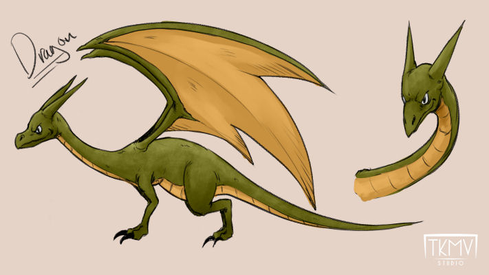
The process started with the character designs. As this is the first book in the series, there were a lot of designs required: Queen Isabella, Princess, Goose, dragons, exterior of Crystal City, and interior of Crystal City. Tony had the full manuscript, my page layout suggestions, and some photos. I also passed along some suggestions for Queen Isabella’s appearance, based on requests from the real Isabella.
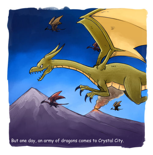
Tony got to work on the character designs. The designs for Princess and Goose were spot on, and I think I accepted the first ones he sent over. We went back and forth quite a bit on Queen Isabella, looking at options for everything from skin tone, to eye size, to the design of her necklace. The dragon was a design where I didn’t provide any direction and gave Tony freedom to come up with a fun dragon appropriate for a children’s book.
The design for Crystal City was an interesting process. Prior to signing a contract with Tony for the book, I asked him to send me a rough sketch of what the artwork would look like. While my vision for Crystal City was a traditional medieval castle, Tony combined elements of a traditional castle with a more fantasy-themed castle – a more literal interpretation of a crystal city. I liked his designs, and we made some small changes and color adjustments. I later asked him to change the color of the flags to match Queen Isabella’s costume (the flag on the left needed to be green, as a green flag on the right would be too close to the green tree…yes, I can be that picky). I remember asking him to change the color of the gate from purple to brown to make it look more medieval. He responded with the color change and the comment he didn’t like it for a children’s book. He was right, and we went back to the original.
Rough Page Layouts
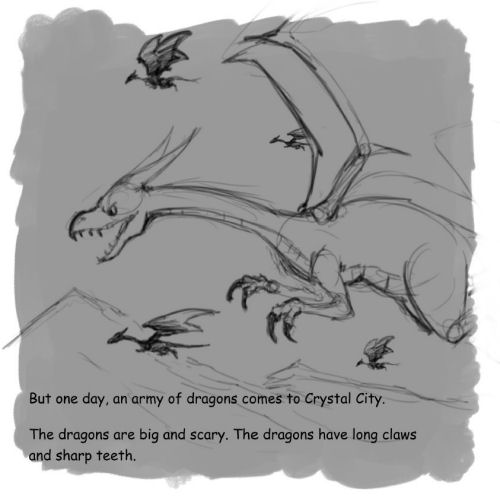
With the final character designs in place, Tony got to work on the page layouts. These are rough outlines of the artwork with the text overlaid on the page to get a general feel for the characters, landscape, and how everything interacts. In some cases, Tony took my ideas, and in some cases he didn’t. I still consider myself lucky that Tony and I work so well together, with neither of us taking offense if the other has a better idea. We made refinements to the designs, and I occasionally made text adjustments as the artwork came in.
Line Art
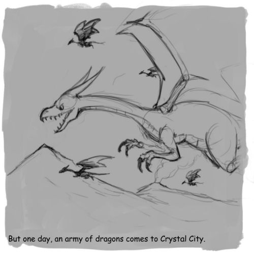
With the approval of the page layouts, Tony started to transform the draft sketches into more final artwork. Most of the changes here revolved around refining certain parts of the artwork – facial expressions and some sizing. Tony also had to make sure that the pages fit within the printer specifications (left and right pages have different formatting to account for the spine). At the end of this phase, the artwork looks a lot like a coloring book.
Page Coloring
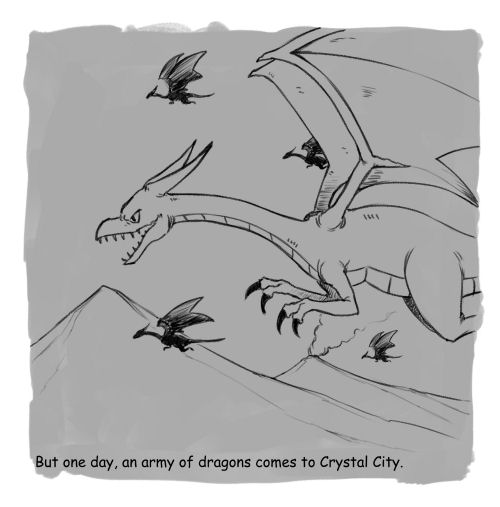
The original coloring process included two steps – a color sample, followed by a final coloring step. I found the color sample process to be a little confusing and we agreed to skip my involvement in that step. We had already agreed on the major colors of the characters and scenery, so I preferred to see the somewhat final coloring step. We didn’t have too much back and forth on this phase. Most of the changes were focused on background colors, little details, and readability of text.
Final Page Formatting
Finally, Tony started to assemble all the pages for printing. For my selected distributor, we needed separate files for the cover and interior pages. Plus separate files for the printed paperback and e-book versions. I learned all sorts of things along the way while researching the printing of children’s books. Did you know the last page needs to be blank? That the number of interior pages should be divisible by four? That there is an online calculator to determine the width of the book’s spine, so the cover is printed correctly? Lots of little details to make sure the book looks professional. I also had to provide Tony with the copyright page, author bio, and other odds and ends to round out the book.
Submission to the Distributor
That’s it! I uploaded the final book files (cover and interior) to my distributor, where they perform some quality control steps to ensure the files are formatted properly. Soon, the Adventures of Princess and Goose Book 1: Chase Away the Dragons will be available for purchase in print and e-book format. Just a short three and a half months after signing the contract with Tony for artwork, the book is now done.
However, that’s not the whole the journey. I’ll have a few more posts about creating Flat Mountain Publishing, all that goes into starting a business, and more about my ongoing efforts to promote and market the book. In the meantime, Tony and I are hard at work on the Adventures of Princess and Goose Book 2: Sir Logan and the Witches.
Purchase the paperback from Amazon
Purchase the ebook from Amazon
Purchase the paperback from Barnes & Noble
Shown below: character designs; page layout Versions 1 and 2; line art; and colored page Versions 1 and 2.


Pingback: Celebrating the Halfway Point (the Journey So Far Part 2) - Flat Mountain Publishing